Saturday, 29 December 2012

My music magazine title font


For the title of my magazine I am not too sure on what font I want to put it in so I decided to experiment with different fonts. Here are the three fonts that I like the most and have the most potential for the magazine:

This font is 'Blackadder ICT'. I like this font the most out of all of the fonts because I like the style of it as it is not just plain. To me, it looks like hand writing. I think that this font really suits the title and the style of it really suits the genre of my magazine (rock) and comes across like a 'gothic' style.


This font is 'Basic Sans Heavy SF'. I like this font because although it is plain, it is also bold and solid which will hopefully draw my reader to the magazine.


This font is 'Accord Light SF'. I like this because it's simple but it's not boring. I like how it's spaced out. It isn't bold but it still stands out and is clear to read. 

Monday, 26 November 2012

Layout of my music magazine


 This is a diagram showing how I want my front cover (left) and contents page (right)  to look like. I have created this because I wanted to set where I want my features to be and I thought that this would give me a good idea of how the magazine will look e.g. messy, neat, organised etc.


This is a diagram of the double page spread layout that I have created. I did this also to see how it would look so I can see if it looks messy, disorganised etc.


Sunday, 25 November 2012

Features for my magazine


These are the features that I have created so far for to be put onto my magazine. 


This is the barcode that I created. I am going to put this on my magazine so that it will look more realistic like a real magazine. I will only put this on the front cover of my magazine as other magazines also only have it on the front (or back). 

On my magazine, I have an idea that I want to put like a 'spray' of white paint over the page of the magazine. To do this, I decided to do it myself and use paint. I painted a black background and then flicked white paint over it. I don't think it worked as well as I would have liked it to so I am going to try another way of making it, but first I am going to put it onto the magazine and then see how it worked. This is how it looked: 


This is the first one that I did, I do not think it is as effective as the second one. If I used this, I would crop it around the bits that I liked and would paste it onto the page, I wouldn't use the whole picture.


This is the second one that I tried. This one looks better than the first, however I still don't  think that they're as effective as I would have liked them to look. I am still going to try to put them on my magazine and see if it does work though because it may look better once it's on the page. 

Pictures for my magazine


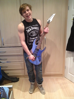
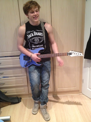
These are some the pictures that I have taken, I am going to edit them and then decide what ones I am going to use. I am not sure how many of these I will decide to use because some of them are very similar however, I want to use as many pictures as I can. 


The reason that these pictures do not have a proper background is because I want to crop the picture out and put it on the background of my magazine. Also, I want to use one of these pictures on the front page of my magazine. 


This is the picture that I have edited.
I am going to use this picture on the front cover of my magazine.

These pictures do have a background. I wanted to experiment with outside as a background because I wanted the pictures to seem more natural and wanted to show the person in the picture in his usual environment but also showing what he does. 

Magazine research - other students magazines


In class, we were given three other magazines that students last year created. We were also given the grades that they had gotten for them too. This really helped me to see how much I need to add onto my own magazine. It also gave me a few ideas of what type of magazine I would like to create and made me think of how I actually want it to look and how I want to set it out. 


Monday, 19 November 2012

Publication Plan


Name of magazine: Resonance
Font of name: "Cracked"
Positioning statement: Front cover: I want my front cover to have a bold title at the top of the page, above the title I want to put a strip with writing on it that will try to really grab the readers attention. I would like to put a full-body shot of my artist in the middle in the page but his head on top of the writing as I like the effect it gives as it seems like the magazine is so popular. I would like to put writing and quotes down either side of the picture too and then have the barcode, issue number, price and date at the bottom of the page.
contents page: I would like to have a picture at the top with writing over the top saying what's inside this week. I would then like to have a couple of pictures down one side and the rest of the space to have the writing.
Double page spread: I would like to have a picture covering the whole of one page with writing on top and another picture on the other page but leaving room for writing around it. I want to put a pull quote in at the bottom of one of the pages also and then on the other page have website details. 
Frequency of publication: One magazine per week
Price: £2.40  
Distribution: Internationally, in local shops and supermarkets
Rationale (what is the thinking behind the magazine- have you identified a gap in the market?): I wanted to create a rock magazine as my favourite music genre is rock. However, from research i've noticed that there are not very many rock magazines out and not all of them are international like I want my magazine to be. I also want it to be aimed at quite a wide target audience as the rock magazines that are out are based for either only teenagers or adults.
Style: Rock music magazine. 
Regular content:  4 double page spreads about major stories for that week, free posters, interviews with band members, news about their lives in general, festival and gig information and weekly competitions
Feature content in your issue: A double-page spread interview with an artist who has had trouble from when he was a young rock-star. He believed that drinking every night would take away all of his worries and help him have fun however, later he realises that drink was his only problem and he noticed that it was coming before his family and friends and also, he finds himself waking up in hospital after a major incident.  
House style: What font will you use? Will it be the same for articles/headings/captions:
I want to use different fonts for the whole of my magazine, this is to make it look more interesting and exciting. I don't want it to look too consistent all the way through as that may seem a bit boring. However, on the same page I don't want it to be lots of different fonts, I would like a maximum of three different fonts on the same page. 
I want the colour scheme to be blue, yellow and black. I like these colours and think they match quite well with eachother. I also think they go with the genre of the magazine which is rock.

Monday, 12 November 2012

Comparison of double page spread


The We Love Pop magazine is a very bold and colourful magazine that uses very bright coloures and large text all over. Because of this I think that the target audience is targeted at mainly females with ages ranging 11-16 year old. The double page spread for this magazine is about the singer Tulisa which relates to the genre of music that this magazine is written about. The structure of this magazine is basically an invterview where  the writers are asking her questions about her about her life at the moment and that relates to now, asking her questions about x factor and the judges. There are 14 pictures altogether on this double page spread which Tulisa is in all of them. All of the pictures are either explained with a caption next to them or underneath or relate to the text near the pictures. The interview is informally written and can br seen as quite comical as you wouldn't expect a normal magazine to randomly talk about 'Hob-Nob' biscuits like We Love Pop do.
 Where the We Love Pop magazine is bold and colourful, the Q magazine is not as 'in your face' as it doesn't use a lot of colours like We Love Pop Do. Also, as you can tell on the We Love Pop magazine the text is very large and stands out massively, the text on Q magazine isn't as large or use as much interesting colours or fonts. The text in the Q magazine is very small which to me seems less appealing because it looks like too much to read as the page is packed with writing, so it's not as appealing. The double page spread is about the rock band Biffy Clyro which also relates to this genre of music that the Q magazine is mostly written on. The structure of it is the same as the We Love Pop magazine, an interview with the band members. Where the We Love Pop magazine is filled with pictures with at least one on every page, the Q magazine is not filled with pictures at all as it only has one giant picture on the page next to it. However, the large picture which fills the whole page is very intising and appealing as it's so large, you can see every detail of the band and you can feel like you know personally what they're getting up to. The We love Pop magazine also has a whole page which is filled with a large picture of Tulisa. The large picture of the band is also explained with a caption next to it which kind of shows their behaviour in the picture. There is also two other captions on top of the picture: one that states a fact that the band are the 'winner of the best live act' and the other telling us the names of the people in the band and explaining what they're doing. This interview is informally written and being quite comical like the We Love Pop magazine is. The We Love Pop interview isn't quite as personal as the Q magazine interview as it's about the band's personal life whereas the We Love Pop magazine asks Tulisa about x factor.

These two magazines have helped a lot in my ideas for my music magazine. I want mine to be a filled and compact magazine like We Love Pop magazine but I don't it to be as 'girly' and 'in your face'. However I don't want it to be as plain as the Q Magazine, like on one of the pages there are no pictures what so ever and just has a page filled with text. However, I like the ideas that both magazines have of a full page in pictures dedicated to the artist. These two magazines have really changed my perspective on what sort of magazine I want to create.


This is the first page of the double page spread of Q Magazine
This is the second page of the double page spread of Q Magazine 

This is the double page spread in We Love Pop Magazine 


Explanation of target audience


For my music magazine, I want to create a rock magazine. I chose to do a rock magazine because rock music is my favourite genre of music. I want to make my magazine to be targeted to both genders but to people who's age ranges from 16-30. 

I would like the magazine to interest people who really want to know about music festivals, albums and bands. I wouldn't want the magazine to just interest people who just want to find out 'celebrity gossip' because although my magazine will have some gossip in it, it won't be a 'gossip magazine'. I would also preferably like to interest the people who actually want to know how to learn songs on their guitars and people who want know to about the latest album releases. 


Contents page analysis


Mixmag:
The Mixmag contents pages looks very neatly organised but very compact with lots of text and a wide range of pictures. The background is coloured black which completely makes the text look brighter and more bold and also makes the pictures much more vibrant and colourful. The pictures are all varied sizes which come across more appealing and attractive and not so boring as they would do if they were the same size. The pictures all relate to the article also and what's inside the magazine. The text is also varied with different sizes, colours and fonts. This also makes the page look much more appealing than it would do if the text was all the same. One of the pictures used is a picture of the front cover which has text below it explaining the additional information about it like who took the picture and who is being photographed in the picture. The numbers which are stating what page where the articles are, are all coloured in yellow. This makes it easy for us to recognise this pattern and will make it easier for us to find the page numbers quickly. Yellow is also a very bright colour so it is very 'in your face' when you look at the page, especially on top of a black background.   There are different headings for the different types of articles like 'fashion', 'tunes' and 'features', this makes it even easier to find the different pages and articles. The date has been added to the contents page so that the read knows the issue and the more up-to-date version. Also, the website of the magazine has been printed onto it so that readers can email them about articles or suggestions, or so that readers can just learn more about the magazine company or more news may be given on the website. The text on the page is written informally like "save dosh: subscribe to Mixmag". I think that this causes the reader to feel much more 'involved' and it's like the writer is talking to the readers like they actually 'know' them. It is also like the writer is giving the reader advice on what to do in their daily lives although they know nothing about the readers. There is lots of advertisements like new cd's, special offers such as free cd's have also been given and advertised on the contents page. I think that the audience of this magazine is directed to both male and female genders but maybe mostly girls as there are lots of articles about fashion although some men are very into fashion too. I think that this magazine is directed to people who are aged 16-30 as it isn't something that little children would be interested in, also for people of both genders. Overall, I think that this is a very neatly thought out, compact and appealing contents page which seems to be very useful.

This is the picture of the MixMag Magazine contents page.

Q Magazine
The Q Magazine contents page looks very busy and full with text and pictures but it has been done neatly and is presented well. Although it seems like the page is full with text, there is not much text to read so it will interest the reader more as people are not usually too keen on too much text. This page has a plain white background however, it can't be seen much because of the largely printed pictures. The contents and contents numbers are written in red, so wherever they were written over the page, we could see exactly and clearly where they are. This contents page seems quite comical as there are lots of little cartoon characters on the top of the page, this makes it look funny and draws your attention to them. With a cartoon character sitting on top of it, the date of the issue is right under the giant bold heading which reads 'Contents'. The date is important as it helps the reader know what issue this is and helps them to know what issue it is in the future. This contents page is also written informally like Mixmag and can be  quite comical with the way the words are written to like "Hurrah to the Olympics, Boo to the quiet gigs in Hyde Park". There are lots of quotes from celebrities printed onto the page too, this will immediately draw the readers attention and want to read what the celebrity has got to say. This magazine has also got subscription advertisement just like the Mixmag magazine which is telling the reader that they will save money, and of course people want to save money so it will draw in the attention. Q magazine have also printed parts of quotes from some of the stories that the reader can read fully. Quotes entice the reader by giving them the true words of a celebrity and not explaining the full story so it forces the reader to buy the magazine in order for them to read the whole story. There is a subheading that reads 'Regulars'. This is to indicate what pages the pages where the usual stories are put for the people who 'regularly' read the magazine and know about these usual type of stories. It also shows a new reader that a lot of people must read the magazine as the regular people will know what section to look for. The date has been printed on the contents page. This is helpful for the readers as they will know also what issue the magazine is just by looking through the date and helps the readers to keep up-to-date with their magazine. The publishers have confessed to their audience that they have made their magazine even better by writing 'Now bigger and better - with added movies, books, DVD's and comics!', this will entice the reader into wanting to see the changes and will make them purchase it. The numbers telling the audience where to find the stories they want to read are not written in numbered order however it doesn't look too confusing. I think that this magazine is directed to people who are aged 16-30 like the mixmag magazine and also for both genders but mainly male. Overall I think that this contents page is presented very neatly as it is not too busy, it seems as though it can attract loads of readers as there are lots of different sizes of pictures which will immediately grab the readers attention. 


This is a picture of the Q magazine contents page. 

NME magazine
The NME contents page looks quite plain as it has a grey background and the heading is written in black. However, it is filled with colourful pictures which will instantly draw the readers attention. The publisher has also used varied text sizes and fonts so that reading the text isn't as boring as it would be if it was all the same sizes and fonts. The numbers of the most important articles have been printed onto the page leaving out all the rest of the numbers for the other pages inside the magazine. These numbers have been written hugely in red which are probably the first things that the reader's eye will catch on the page. This is important as obviously it helps them to find the pages that the publishers most want the readers to read. With every number, there is a picture and a caption that explains shortly and quickly what that article is about. The date has been printed onto the contents page like the other two magazines. The date is really helpful for readers to know what issue they have and helps them to know if they're keeping up or not. Also like the other two magazines, the publishers have printed quotes of celebrities which give a little insight of what's inside and what more they can read about. One of the biggest pictures on the page is a picture showing lots of NME magazines with text written on the top of it. This picture explains what better deals they can get when subscribing to the magazine. This will not only earn more money for the magazine company but will save money for their readers. This contents page is also informally written. It's like the words talk and communicate with you like they know you, this will draw the reader in and make them feel very much more involved, also writing informally can be quite humorous at the same time. The contents page seems to be very neatly organised but still has a reasonable amount of text and pictures like the other magazines. However, this contents page isn't as full as the other magazines as there is less of everything on the page but still tells the readers what they have got to know. I think that this magazine is directed to people who are aged 16-40 because it has got artists on it that both younger and older people would know although it is not something that younger children would want to read or would be attracted to. I also think that it is directed to mainly males however some females will read it too. Overall, I think that this contents page has neatly given the readers all they need to know cleverly with pictures to draw their attention more. However I do not think that it would grabs the readers attention as much as mixmag would do.

This is a picture of the NME contents page. 
We Love Pop magazine 
The first thing that the readers will notice about this magazine is its bright colours all over the page also by this we notice that the contents page is literally jam-packed full with gossip, pictures and text for especially for the reader. This will really entice the reader because it is very appealing and doesn't look like a boring magazine to read. Before the actual title of the magazine is printed, you see 'WE LOVE THIS...' before it. This will instantly attract the reader to the page, not only because the writing is so large and bold but because the readers will be wondering 'what do they love?' and will force them to read the rest of the page and magazine to find out. There are plenty of pictures spread out on the page all varied in size with a huge picture printed right in the middle. This picture shows what artist the main article is about. Underneath the brightly coloured pictures, there are quotes which the celebrities have told us. This will make us want to read much further on to read the full story and will teach the reader what opinions that specific celebrity has. In a line crossing the bottom of the page, it shows mini pictures of all the posters that the readers will be able to get free with this magazine. There are 11 free posters within this magazine, this will very much attract the reader even if they do not even want the magazine to read it, they may want to buy it, just to get their free posters. The text is also informally written like all of the other magazine contents pages and in this one, the editor of the magazine has personally written to the reader which will make the reader feel even more involved and personal. The text varies in size, colour and font. This makes the page look very much more attractive and is also less boring for the reader to see. The website of the magazine has been printed clearly on the very bottom of the page to inform the reader that they do have a website, and also may make the reader want to know more gossip and news, so readers will go onto it. The white background that this page has got, is actually very appealing as there are lots of bright colours printed on top which make them look even brighter with the plain colour white behind them. Although this contents page is totally filled and covered with lots of different texts, pictures and colours, it doesn't look messy or unattractive because it looks like it has still been neatly thought out. I think that this magazine is directed to people who are aged 12-20 as it is something that younger and slightly older would both want to read. This is because of its appealing colours and jam-packed page. I also think that it is directed at females as I think that very few males would buy and read this magazine. Overall, I think that this magazine has been very well thought out with lots to read and see and will get the reader even more excited to read what other gossip, news and interviews are inside. 

This is a picture of the We Love Pop contents page. 


Sunday, 11 November 2012

Compare the covers of two music magazines


In this essay I am going to compare two magazines; Total Guitar magazine and We Love Pop magazine. The magazines vary in the way they differ and the similarities they have.

 Total Guitar is a rock magazine that is aimed at teenagers onwards who are into rock music. The Total Guitar cover is quite ‘dark’ and looks more complicated showing and talking about lots of different articles, guitar tabs, interviews and reviews inside, whereas We Love Pop is aimed at young – teenage girls who are interested in Pop.  This cover is very bright and stands out boldly. Just by looking at it you can tell that the magazine is jam-packed with gossip, quotes and promotions.


On the cover of Total Guitar, the full shot picture of the cover star is over the top of the title of the magazine however a band name has been printed on top of him in a bright and bold colour of pink. This reflects that people will already know the title of the magazine as they buy it every month so they do not have to see the full title, this also links into the statistic which is printed on the magazine ‘Europe’s best-selling guitar magazine’ which proves that people do buy it monthly. Although on the cover of the We Love Pop magazine, Tulisa, the cover star of this week’s magazine is being slightly covered by the title of the magazine and other cover stories. However, the picture on the We Love Pop magazine, the cover star is printed much bigger and in brighter colour so we can see her more clearly and it doesn’t matter if she is being covered slightly.


From the cover of Total Guitar, I have learnt that although the cover is printed in quite dull colours, there are lots of presentational devices such as the cover stories, statistics and pictures which make it into a much more exciting magazine that easily entices you in to read it, also the magazine really links to its genre. From the cover of the We Love Pop magazine, I have learnt that bold and bright colours of the background and texts are really in your face but make you want to read it. The use of the different font sizes, colours and cases that they are in draw more attention as it looks like it is more packed with gossip which is more interesting.


These two magazines have made me think a lot about what I want to put in my own music magazine. I really like the Total Guitar magazine and has made me want to create my own rock magazine as I like rock music and rock bands. The We Love Pop magazine looks really full and busy on the front cover and filled with gossip about celebrities, this has made me realise that I don’t want my magazine to be totally compact with gossip but full with news about music and music bands. Looking at two completely different magazines has really helped me with my decision on what I want my magazine to be like and look like and has also helped me learn a lot about what devices to use and what ones make a magazine look good.


These are the two magazines that I have compared.

My magazine questionnaire


To help create a successful magazine, we have been asked to make a questionnaire so that we can ask people what sort of things they'd like to see in our magazines. This will help us to decide on exactly what we want in our magazines and also see other peoples views to our ideas. 

This is my questionnaire: 

I have made this questionnaire so that your answers will help me with ideas to create my music magazine in Media. 

1. Gender: Male  Female  (Please circle answer) 


2. Age: Under 16     16 - 20     21 - 25     26 - 30     30+  (Please circle answer) 


3. What sort of music genre are you into?: 
R&B     Pop     Rock     Metal     Classical     Other_____________  (Please circle answer - if answered 'other' please answer on the line) 

4. How much would you spend on a music magazine weekly?
Less than £1     £1 - £1.50     £1.51 - £2.00     £2.01 - £2.50     £2.51 - £3.00     £3.01+


5. What are your favourite artists/bands relating to your favourite music genre?:

__________________________________________________________________


6. What  would attract you to the front cover of a magazine? 

__________________________________________________________________


7. What colours do you think would be used on the front cover of a rock magazine?

__________________________________________________________________ 


8. What do you think is most important to see on the cover of a magazine? 

__________________________________________________________________ 


9. What music magazine do you buy/is your favourite? 

__________________________________________________________________


10. Would what you expect to see inside of a magazine? 

__________________________________________________________________


I put these questions into my questionnaire because I wanted to see what music genre people like the most as I want to do a rock magazine, but depending on how many people actually like rock then that will determine whether I will make a rock magazine or not. I asked a lot of questions like what sort of things would people like to see in a magazine so that would give me ideas on what to actually put on my magazine cover and also inside of my magazine. Also, I asked about what colours people think would suit a rock magazine because preferably I do want to create a rock magazine, so if I do decide to make one then that will give me specific ideas for it. I asked about what gender the people answering my questions are just because my magazine isn't necessarily for a specific gender however, people who like rock are stereotypically male. 


Music magazine collage


This is my music magazine collage:


I wanted my collage to really show what the genre of my magazine is going to be. I want my magazine to be a rock magazine. This collage is covered with pictures of different rock bands that I like and that i want to put in my magazine. I've put album cover pictures also onto this, to communicate that my magazine is going to have advertisements of new albums out. 

Magazine Publishers


Main Magazine publishers
  • Bauer Media
  • National Magazine company
  • Future Publishing
  • IPC Media
What magazines do they publish?


Bauer Media:
  • Music magazines such as: Kerrang, MOJO, Q
  • Mens magazine: ZOO, FHM
  • Nature magazines: Garden Answers, Bird Watching,Country Walking
  • Car magazines: Classic Car Weekly, Car Mechanics, Classic Cars
  • Mother and Baby magazines: Mother and Baby, Prengancy and Birth
  • Gossip magazines: Closer, Heat, More
  • Fashion magazines: Grazia
  • Sports: GOLF illustrated, Golf World, RiDE
 Ethos of Baeur Media:
  •  The ethos of this is that they have quite a mixture of genres in the magazines they publish. They publish a magazine for each genre and ages and audiences vary for each magazine.
How successful are they?
  • Bauer Media is Europes largest privately owned publishing group. Bauer Media create a very wide range of magazines offering over 300 magazines in 15 countries as well as online, TV and radio stations.

National Magazine Company:
  • Tv magazines: All About Soaps, Inside Soap
  • Fashion magazines: Elle, Elle decoration, Bazaar, Esquire, Handbag, Prima
  • Gossip/Womens magazine: Cosmopolitan, Best, Reveal, Bazaar, Red
  • House magazines: Good Housekeeping, House Beautiful
  • Teen magazines: Sugar Scope
  • Health magazines: Net Doctor
Ethos of National Magazine Company:
  • The National Magazine Company publish magazines mostly for women as most of the magazines are about gossip and womens fashion. They also publish House magazines which stereotypically is aimed at women.
How successful are they?
  • This company is the largest UK digital publisher and is one of the UK'S leading media companys with 24 magazine brands and 22 digital assets.

Future Publishing
  • Technology magazines: Mac Format, PC Plus, Windows: The official magazine
  • Games magazines: Nintendo Power, Xbox 360: The official magazine, GamesMaster
  • Music magazines: Total Guitar, Metal Hammer, Classic RoCK, Future Music
  • Sports: Cycling Plus, Mountain Biking UK, Triatholon Plus
  • Auto: Classic Ford, Mini Magazine, Trucking, Truckstop News
  • Craft magazines: The knitter, Your Family tree, Mollie Makes
Ethos of Future Publishing:

  • Future Publishing mostly publish mens magazines such as sports and car magazines. However they do publish craft magazines such as 'The knitter' which people would think are stereotypically aimed at women. 
How successful are they?

  • Future Publishing attracts more than 45 million monthly unique visitors to our digital properties websites; and we deliver over 100 digital editions and bespoke apps on tablet devices. They sell 2.2 million magazines every month, and export or syndicate to 89 countries, making us the UK’s number one exporter and licensor of magazine content. Our most successful products include TechRadar (the UK’s number one consumer technology website), T3,Total Film, BikeRadar, MusicRadar, ClassicRock, GamesRadar, Digital Camera, Mollie Makes and Official Xbox Magazine. 
IPC Media
  • Country pursuits and equestrian: Country Life, Horse & Hound, Eventing
  • Fashion and beauty: Look, Marie Claire, Now 
  • Home interest: 25 Beautiful homes, Homes & Gardens, Ideal Home 
  • Lifestyle: Essentials, Woman&Home Feel Good Food, Wallpaper* 
  • Sport and Leisure: Cycling Active, Amateur Photographer, Golf Monthly
  • Teen: Teen Now 
  • Tv Entertainment: Soap Life, Tv Times, What's On Tv 
  • Women's Weeklies: Women's Weekly, Woman, Pick Me Up 
  • Young Men and Music: NME, Nuts, Uncut 
Ethos of IPC Media: 

  • With more than 60 iconic media brands, IPC creates content for multiple platforms, across print, online, mobile, tablets and events.

How successful are they?

  • IPC Media is the UK's leading consumer magazine and digital publisher. They engage with 26 million UK adults - almost two thirds of UK women and over 40% of UK men. Our award winning portfolio of websites reaches over 25 million global users every month. 

Final school magazine and contents page design


This is my final magazine cover page. For my background, I still used the picture of the school gates but I had to change the contrast to make it more 'dull' so that the text could be read. However, I found out that by changing the contrast, it looked boring and dark so I decided to give the background some slight colour, enough to see and make the magazine cover look more interesting but clear enough to be able to read the text on top of it. The text I have kept the same as the others, giving it varied fonts, colours and sizes just to make it look more appealing. However, I didn't use very bright colours for the title, subtitle and text about the inside of the magazine as I think it wouldn't really match with the colour on the background, so I left it with the colours black and white. This also makes the text more clear and easier to read. However, the date that I have added is in red so that it would stand out for the students to read and know what issue this is and will know what magazine is more up-to-date and helpful for them to understand the information in them. I added three edited pictures which are 'smudged' into the page, I did this because I think it looks affective and smooth and like I said before, not like I have just copied and pasted pictures onto the page. I put these pictures on the bottom of the page in a line, like my last contents page draft, because I thought it looked neater than it did on my last cover draft where they were all spaced out. I think that this makes the pictures clearer to see because they are in colour and also, I 'sharpened' the pictures to make them stand out. 


This is my final contents page for my school magazine. For the background, I used the picture of the school gates again but changed the colour. I did this so that it wouldn't look exactly the same as the cover and gives the idea that if I had created a whole magazine, all the pages would be different colours which is much more appealing and exciting. Like I have done with all of my drafts, I have varied the font, colour and size of my text just so it wouldn't look plain and boring and would hopefully grab someones attention. I put the title and subtitle in black  because I thought that this stood out more than the colours I tried like, red, purple and a darker shade of green so eventually I chose black also because it was much clearer to read over the background. I put the contents and 'Pg' in blue and white because I wanted to make them look striking and stand out. Also, the actual contents inside the magazine is written in black. I did this so the text would be as clear as possible to read because obviously, is the most important part of the contents page. For the pictures, I have kept the idea of lining them up so that they look neat and clear to see but also instead of putting them across the bottom, I have put them horizontally along the page. I did this because I have put another picture of a student doing her work which fills the side and some of the bottom of the page so I thought it would look too cramped if I put all of the pictures across the bottom. I have also varied the size of the picture of the student working and the other pictures along the side. I thought that this would look really affective as the pictures aren't just in one bunch in a certain place on the page, they are all over, but neatly done. The picture of the student has also been cropped out of the original background. I did this so it wouldn't just look like i'd placed the picture on top of the background and not edited it.

Second draft of my school magazine and contents page


This is my second draft of my school magazine. I think this one is much better than my first as it is much more brighter and more 'in your face'. In this draft, I used a picture that I took of the school gates as my background, so it shows the school and the school logo together. I also used  three of the pictures that I edited on Photoshop and 'smudged' them into the background so it would look like one picture. I also think by smudging the pictures, it looks more smooth and more like a proper magazine and not just the look of copying and pasting pictures on top. In this draft, I also varied the text size, colour and font like the other one as I thought it made the magazine more appealing and affective. I have also added the date so it would look more like a proper magazine. Although I feel that this magazine draft is a lot better than my last, I think that this one is a bit too busy as the colour of my background is too bright and because of that, you can't read the text very well and also you can't see the pictures that I added very clearly. In my next one, I am going to try to edit the colour of the background so it will not be as bright but keep the text varied and bright, and also keep the pictures that I edited and added to it. 
This is my second draft of my school magazine contents page. Overall, I think that this contents page is a lot better than the other one as in my opinion, it doesn't look as messy but looks more compact with lots of text and pictures. I have carried on using the school gates as the background so my magazine looks more consistent. In my next magazine contents page I would like to keep this picture for both the cover and contents background but change the colour of the background on both so they're slightly different. Again, I used varied text sizes, colours and fonts because I think that it is affective. On this draft, I put the photo's that I edited on Photoshop in lines on the top and bottom of the page to make it look neater and clearer to look at. In my next contents page draft of this, I am going to try to make the text clearer to read, by changing the background colour like I said but also by making the text brighter so it is more 'in your face'. 

First draft of my school magazine and contents page


This is my first draft of my school magazine cover. I created a plain grey background with just the school logo on the cover because I wanted to show off the school logo so the magazine would be distinctive. I have varied the size, fonts and colours of the text to make it look more interesting. In my opinion, I do not think that this worked as I find this magazine cover too plain. There are not any pictures on it, however I like the idea of the varied text sizes and fonts. In my next draft of the front cover, I am going to try and create it in colour and put lots of pictures and more text on it so it will be more appealing, interesting and striking.


This is my first contents page draft. I created this with a lighter grey background so that you could read the writing easier. The background on my contents page also has the school logo on it also, I did this so it would look consistent and neat. I also varied the text font so it would look interesting. I added pictures of things in/happening around school which relate to the contents page stories. I also didn't add all of the stories that I was going to like 'Speak out' and 'Mr. Wilcocks say', so in my next one I am going to be adding them. Although I think that the contents page looks more interesting and busier than the magazine cover, I still think that it looks too bland and colourless. I think it looks a bit too messy as the pictures aren't exactly in line and the same size. On my next draft, I want to make it much more colourful so someone will be  automatically attracted to it and then draw them in.