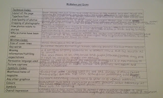
In this lesson we were given two other magazines, 'Woman' and 'Ruislip Eye' and were asked to analyse them both. We had to analyse them going by:
- Technical codes - layout of the page, typeface/font, size/quality of photos, cropping of photographs, how photos relate to stories and why pictures have been used
- Written codes - size of cover lines, key words, missing information/fulfilling expectations, persuasive language used and picture captions.
- Symbolic codes - masthead/name of magazine, any other graphics, colours, symbols and overall impression.
 |
| This is the magazine that I analysed. |
 |
| This is the analysation of the magazine. |
 |
| This is the school magazine that I analysed. |
 |
| This is the analysation of the school magazine. |
No comments:
Post a Comment