This video is of me explaining the differences between my two products, the preliminary magazine and the actual magazine. It shows differences between them and also explains what I have learnt from making them and from my knowledge of certain technologies and programs, it was a lot easier when creating my final magazine.
Showing posts with label Evaluation. Show all posts
Showing posts with label Evaluation. Show all posts
Tuesday, 19 March 2013

Monday, 18 March 2013
How does your media product represent social groups?
This Prezi explains the type of social groups I have represented within my magazine and helps to explain why I chose to create my magazine the way that I did.
Friday, 15 March 2013
What would be the perfect audience for your media product? How did you address/attract your audience?
This Prezi shows my idea of my perfect reader. I wanted someone who looked like the type of stereotypical person you'd see reading my magazine.
Monday, 11 March 2013
What have you learnt about technologies from contrasting your products?
I created this slideshare to help me explain the different types of technologies that I have used to help me create my products and learning about them before starting to create the products.
Thursday, 7 March 2013
What kind of media institution might distribute your product and why?
There are two media institutions that I think would think about distributing my product; IPC Media and Bauer Media.


I think IPC Media may think about publishing my magazine because both of the magazines that they distribute, NME and Uncut are both based within the rock genre, and so is my magazine. By looking at the NME and Uncut magazines, it is obvious that they care a lot about presentation and both magazines use a lot of white which my magazine does too on the contents page and the double page spread.It seems as though both of the magazines use a lot of white so that they wouldn't look too busy or hard to read. IPC Media has two rock magazines which seem to be based for audiences around 20 onwards, they may have a gap where they would like to own a magazine which would be a great attraction for younger people too. My magazine is based for people aged from around 14 onwards, so much more appealing to younger people. Also, because of the audience ages that the two other magazines may be based, they may have stars, celebrities, bands and artists that maybe younger people wouldn't recognise as much as the stars, celebrities, bands and artists they're used to. So it might be a great advantage to take on a magazine based for young people. NME is also a very big company who own their own radio station and even have NME awards. So hopefully my magazine could be just like that with the help from ICP Media for younger people onwards.

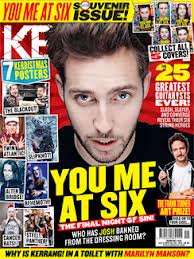
Although I also think that Bauer Media may think about publishing my magazine because the famous magazine Kerrang! which is in the rock genre is distributed from there. As they only have one rock genre magazine, my magazine would fit in with that and offer the audience more of a choice. Kerrang! seems to be based for all ages from 14 onwards like the same as mine. Although it may seem bad to have the same genre music magazine and having the same based audience, it would give the audience more choice. The audience may like purchasing the two different magazines for different reasons, e.g. The festival line up's are different, different posters and different interviews with different celebrities, stars, artists and bands so it is like they are getting the most gossip/pictures/information that they want.
Monday, 4 March 2013
In what ways does your media product use, develop or challenge forms and conventions of real media products?
\\
This Prezi explains ideas and conventions of real-life magazines that I liked that I wanted to add onto my own magazine, just in my own way.
Tuesday, 19 February 2013
My target audience videos - Second Person
This is a video of Sade, one of my target audience.
in it she explains what she really likes about the magazine:
- The front cover is effective as the writing stands out and catches readers eye
- Likes the use of advertising
- The pull quote 'My fans saved me' is effective and would catch the readers eye
- Good use of magazine conventions like barcode, price, issue number and date
- Likes the use of images, they're in high definition
- Contents page is really effective because of the different headings
- Double page spread flows onto both pages
- Use of font colours match with the sex of the male artist
- The blue, white and red poses shows magazine is from the rock genre
My target audience videos - First Person
This is a video of Ciara, one of my target audience.
In it she says what she really likes about the magazine:
- Likes the yellow within the colour scheme as it brings out specific things like the pull quote
- The way the picture overlaps the text, it looks effective as it seems as though he's walking through the page
- The title looks effective as the lines that i've put through it makes it look edgy and 'rockish'
- Likes the contents page colour scheme
- The yellow draws your eye to the specific heading like 'contents page'
- The fancy writing used contrasts against the rock theme but works really well and looks effective
- The double page spread colour scheme looks effective as i've used white writing for the questions and blue for the answers
- Likes the use of the pull quote 'I even got kicked out of my own gig'
- The blue on the black background makes it stand out
- The pictures used are good quality
- The pictures are really well edited
Subscribe to:
Posts (Atom)