Mixmag:
The Mixmag contents pages looks very neatly organised but very compact with lots of text and a wide range of pictures. The background is coloured black which completely makes the text look brighter and more bold and also makes the pictures much more vibrant and colourful. The pictures are all varied sizes which come across more appealing and attractive and not so boring as they would do if they were the same size. The pictures all relate to the article also and what's inside the magazine. The text is also varied with different sizes, colours and fonts. This also makes the page look much more appealing than it would do if the text was all the same. One of the pictures used is a picture of the front cover which has text below it explaining the additional information about it like who took the picture and who is being photographed in the picture. The numbers which are stating what page where the articles are, are all coloured in yellow. This makes it easy for us to recognise this pattern and will make it easier for us to find the page numbers quickly. Yellow is also a very bright colour so it is very 'in your face' when you look at the page, especially on top of a black background. There are different headings for the different types of articles like 'fashion', 'tunes' and 'features', this makes it even easier to find the different pages and articles. The date has been added to the contents page so that the read knows the issue and the more up-to-date version. Also, the website of the magazine has been printed onto it so that readers can email them about articles or suggestions, or so that readers can just learn more about the magazine company or more news may be given on the website. The text on the page is written informally like "save dosh: subscribe to Mixmag". I think that this causes the reader to feel much more 'involved' and it's like the writer is talking to the readers like they actually 'know' them. It is also like the writer is giving the reader advice on what to do in their daily lives although they know nothing about the readers. There is lots of advertisements like new cd's, special offers such as free cd's have also been given and advertised on the contents page. I think that the audience of this magazine is directed to both male and female genders but maybe mostly girls as there are lots of articles about fashion although some men are very into fashion too. I think that this magazine is directed to people who are aged 16-30 as it isn't something that little children would be interested in, also for people of both genders. Overall, I think that this is a very neatly thought out, compact and appealing contents page which seems to be very useful.
 |
| This is the picture of the MixMag Magazine contents page. |
Q Magazine
The Q Magazine contents page looks very busy and full with text and pictures but it has been done neatly and is presented well. Although it seems like the page is full with text, there is not much text to read so it will interest the reader more as people are not usually too keen on too much text. This page has a plain white background however, it can't be seen much because of the largely printed pictures. The contents and contents numbers are written in red, so wherever they were written over the page, we could see exactly and clearly where they are. This contents page seems quite comical as there are lots of little cartoon characters on the top of the page, this makes it look funny and draws your attention to them. With a cartoon character sitting on top of it, the date of the issue is right under the giant bold heading which reads 'Contents'. The date is important as it helps the reader know what issue this is and helps them to know what issue it is in the future. This contents page is also written informally like Mixmag and can be quite comical with the way the words are written to like "Hurrah to the Olympics, Boo to the quiet gigs in Hyde Park". There are lots of quotes from celebrities printed onto the page too, this will immediately draw the readers attention and want to read what the celebrity has got to say. This magazine has also got subscription advertisement just like the Mixmag magazine which is telling the reader that they will save money, and of course people want to save money so it will draw in the attention. Q magazine have also printed parts of quotes from some of the stories that the reader can read fully. Quotes entice the reader by giving them the true words of a celebrity and not explaining the full story so it forces the reader to buy the magazine in order for them to read the whole story. There is a subheading that reads 'Regulars'. This is to indicate what pages the pages where the usual stories are put for the people who 'regularly' read the magazine and know about these usual type of stories. It also shows a new reader that a lot of people must read the magazine as the regular people will know what section to look for. The date has been printed on the contents page. This is helpful for the readers as they will know also what issue the magazine is just by looking through the date and helps the readers to keep up-to-date with their magazine. The publishers have confessed to their audience that they have made their magazine even better by writing 'Now bigger and better - with added movies, books, DVD's and comics!', this will entice the reader into wanting to see the changes and will make them purchase it. The numbers telling the audience where to find the stories they want to read are not written in numbered order however it doesn't look too confusing. I think that this magazine is directed to people who are aged 16-30 like the mixmag magazine and also for both genders but mainly male. Overall I think that this contents page is presented very neatly as it is not too busy, it seems as though it can attract loads of readers as there are lots of different sizes of pictures which will immediately grab the readers attention.
 |
| This is a picture of the Q magazine contents page. |
NME magazine
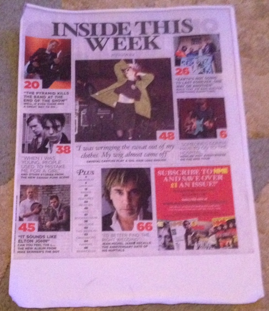
The NME contents page looks quite plain as it has a grey background and the heading is written in black. However, it is filled with colourful pictures which will instantly draw the readers attention. The publisher has also used varied text sizes and fonts so that reading the text isn't as boring as it would be if it was all the same sizes and fonts. The numbers of the most important articles have been printed onto the page leaving out all the rest of the numbers for the other pages inside the magazine. These numbers have been written hugely in red which are probably the first things that the reader's eye will catch on the page. This is important as obviously it helps them to find the pages that the publishers most want the readers to read. With every number, there is a picture and a caption that explains shortly and quickly what that article is about. The date has been printed onto the contents page like the other two magazines. The date is really helpful for readers to know what issue they have and helps them to know if they're keeping up or not. Also like the other two magazines, the publishers have printed quotes of celebrities which give a little insight of what's inside and what more they can read about. One of the biggest pictures on the page is a picture showing lots of NME magazines with text written on the top of it. This picture explains what better deals they can get when subscribing to the magazine. This will not only earn more money for the magazine company but will save money for their readers. This contents page is also informally written. It's like the words talk and communicate with you like they know you, this will draw the reader in and make them feel very much more involved, also writing informally can be quite humorous at the same time. The contents page seems to be very neatly organised but still has a reasonable amount of text and pictures like the other magazines. However, this contents page isn't as full as the other magazines as there is less of everything on the page but still tells the readers what they have got to know. I think that this magazine is directed to people who are aged 16-40 because it has got artists on it that both younger and older people would know although it is not something that younger children would want to read or would be attracted to. I also think that it is directed to mainly males however some females will read it too. Overall, I think that this contents page has neatly given the readers all they need to know cleverly with pictures to draw their attention more. However I do not think that it would grabs the readers attention as much as mixmag would do.
 |
| This is a picture of the NME contents page. |
We Love Pop magazine
The first thing that the readers will notice about this magazine is its bright colours all over the page also by this we notice that the contents page is literally jam-packed full with gossip, pictures and text for especially for the reader. This will really entice the reader because it is very appealing and doesn't look like a boring magazine to read. Before the actual title of the magazine is printed, you see 'WE LOVE THIS...' before it. This will instantly attract the reader to the page, not only because the writing is so large and bold but because the readers will be wondering 'what do they love?' and will force them to read the rest of the page and magazine to find out. There are plenty of pictures spread out on the page all varied in size with a huge picture printed right in the middle. This picture shows what artist the main article is about. Underneath the brightly coloured pictures, there are quotes which the celebrities have told us. This will make us want to read much further on to read the full story and will teach the reader what opinions that specific celebrity has. In a line crossing the bottom of the page, it shows mini pictures of all the posters that the readers will be able to get free with this magazine. There are 11 free posters within this magazine, this will very much attract the reader even if they do not even want the magazine to read it, they may want to buy it, just to get their free posters. The text is also informally written like all of the other magazine contents pages and in this one, the editor of the magazine has personally written to the reader which will make the reader feel even more involved and personal. The text varies in size, colour and font. This makes the page look very much more attractive and is also less boring for the reader to see. The website of the magazine has been printed clearly on the very bottom of the page to inform the reader that they do have a website, and also may make the reader want to know more gossip and news, so readers will go onto it. The white background that this page has got, is actually very appealing as there are lots of bright colours printed on top which make them look even brighter with the plain colour white behind them. Although this contents page is totally filled and covered with lots of different texts, pictures and colours, it doesn't look messy or unattractive because it looks like it has still been neatly thought out. I think that this magazine is directed to people who are aged 12-20 as it is something that younger and slightly older would both want to read. This is because of its appealing colours and jam-packed page. I also think that it is directed at females as I think that very few males would buy and read this magazine. Overall, I think that this magazine has been very well thought out with lots to read and see and will get the reader even more excited to read what other gossip, news and interviews are inside.
 |
| This is a picture of the We Love Pop contents page. |