Saturday, 29 December 2012

My music magazine title font


For the title of my magazine I am not too sure on what font I want to put it in so I decided to experiment with different fonts. Here are the three fonts that I like the most and have the most potential for the magazine:

This font is 'Blackadder ICT'. I like this font the most out of all of the fonts because I like the style of it as it is not just plain. To me, it looks like hand writing. I think that this font really suits the title and the style of it really suits the genre of my magazine (rock) and comes across like a 'gothic' style.


This font is 'Basic Sans Heavy SF'. I like this font because although it is plain, it is also bold and solid which will hopefully draw my reader to the magazine.


This font is 'Accord Light SF'. I like this because it's simple but it's not boring. I like how it's spaced out. It isn't bold but it still stands out and is clear to read. 

Monday, 26 November 2012

Layout of my music magazine


 This is a diagram showing how I want my front cover (left) and contents page (right)  to look like. I have created this because I wanted to set where I want my features to be and I thought that this would give me a good idea of how the magazine will look e.g. messy, neat, organised etc.


This is a diagram of the double page spread layout that I have created. I did this also to see how it would look so I can see if it looks messy, disorganised etc.


Sunday, 25 November 2012

Features for my magazine


These are the features that I have created so far for to be put onto my magazine. 


This is the barcode that I created. I am going to put this on my magazine so that it will look more realistic like a real magazine. I will only put this on the front cover of my magazine as other magazines also only have it on the front (or back). 

On my magazine, I have an idea that I want to put like a 'spray' of white paint over the page of the magazine. To do this, I decided to do it myself and use paint. I painted a black background and then flicked white paint over it. I don't think it worked as well as I would have liked it to so I am going to try another way of making it, but first I am going to put it onto the magazine and then see how it worked. This is how it looked: 


This is the first one that I did, I do not think it is as effective as the second one. If I used this, I would crop it around the bits that I liked and would paste it onto the page, I wouldn't use the whole picture.


This is the second one that I tried. This one looks better than the first, however I still don't  think that they're as effective as I would have liked them to look. I am still going to try to put them on my magazine and see if it does work though because it may look better once it's on the page. 

Pictures for my magazine


These are some the pictures that I have taken, I am going to edit them and then decide what ones I am going to use. I am not sure how many of these I will decide to use because some of them are very similar however, I want to use as many pictures as I can. 


The reason that these pictures do not have a proper background is because I want to crop the picture out and put it on the background of my magazine. Also, I want to use one of these pictures on the front page of my magazine. 


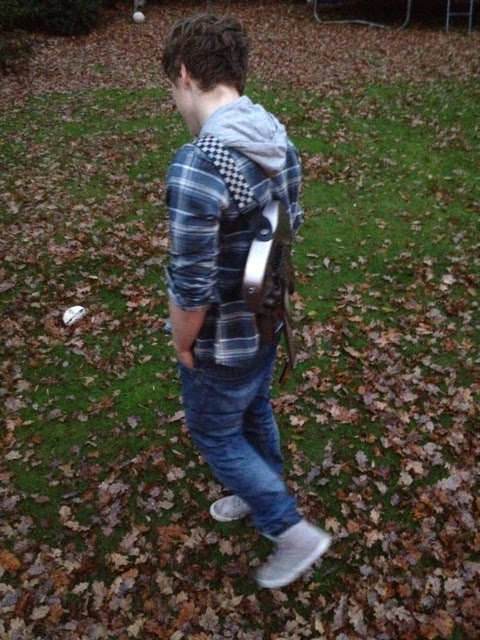
This is the picture that I have edited.
I am going to use this picture on the front cover of my magazine.

These pictures do have a background. I wanted to experiment with outside as a background because I wanted the pictures to seem more natural and wanted to show the person in the picture in his usual environment but also showing what he does. 

Magazine research - other students magazines


In class, we were given three other magazines that students last year created. We were also given the grades that they had gotten for them too. This really helped me to see how much I need to add onto my own magazine. It also gave me a few ideas of what type of magazine I would like to create and made me think of how I actually want it to look and how I want to set it out. 


Monday, 19 November 2012

Publication Plan


Name of magazine: Resonance
Font of name: "Cracked"
Positioning statement: Front cover: I want my front cover to have a bold title at the top of the page, above the title I want to put a strip with writing on it that will try to really grab the readers attention. I would like to put a full-body shot of my artist in the middle in the page but his head on top of the writing as I like the effect it gives as it seems like the magazine is so popular. I would like to put writing and quotes down either side of the picture too and then have the barcode, issue number, price and date at the bottom of the page.
contents page: I would like to have a picture at the top with writing over the top saying what's inside this week. I would then like to have a couple of pictures down one side and the rest of the space to have the writing.
Double page spread: I would like to have a picture covering the whole of one page with writing on top and another picture on the other page but leaving room for writing around it. I want to put a pull quote in at the bottom of one of the pages also and then on the other page have website details. 
Frequency of publication: One magazine per week
Price: £2.40  
Distribution: Internationally, in local shops and supermarkets
Rationale (what is the thinking behind the magazine- have you identified a gap in the market?): I wanted to create a rock magazine as my favourite music genre is rock. However, from research i've noticed that there are not very many rock magazines out and not all of them are international like I want my magazine to be. I also want it to be aimed at quite a wide target audience as the rock magazines that are out are based for either only teenagers or adults.
Style: Rock music magazine. 
Regular content:  4 double page spreads about major stories for that week, free posters, interviews with band members, news about their lives in general, festival and gig information and weekly competitions
Feature content in your issue: A double-page spread interview with an artist who has had trouble from when he was a young rock-star. He believed that drinking every night would take away all of his worries and help him have fun however, later he realises that drink was his only problem and he noticed that it was coming before his family and friends and also, he finds himself waking up in hospital after a major incident.  
House style: What font will you use? Will it be the same for articles/headings/captions:
I want to use different fonts for the whole of my magazine, this is to make it look more interesting and exciting. I don't want it to look too consistent all the way through as that may seem a bit boring. However, on the same page I don't want it to be lots of different fonts, I would like a maximum of three different fonts on the same page. 
I want the colour scheme to be blue, yellow and black. I like these colours and think they match quite well with eachother. I also think they go with the genre of the magazine which is rock.

Monday, 12 November 2012

Comparison of double page spread


The We Love Pop magazine is a very bold and colourful magazine that uses very bright coloures and large text all over. Because of this I think that the target audience is targeted at mainly females with ages ranging 11-16 year old. The double page spread for this magazine is about the singer Tulisa which relates to the genre of music that this magazine is written about. The structure of this magazine is basically an invterview where  the writers are asking her questions about her about her life at the moment and that relates to now, asking her questions about x factor and the judges. There are 14 pictures altogether on this double page spread which Tulisa is in all of them. All of the pictures are either explained with a caption next to them or underneath or relate to the text near the pictures. The interview is informally written and can br seen as quite comical as you wouldn't expect a normal magazine to randomly talk about 'Hob-Nob' biscuits like We Love Pop do.
 Where the We Love Pop magazine is bold and colourful, the Q magazine is not as 'in your face' as it doesn't use a lot of colours like We Love Pop Do. Also, as you can tell on the We Love Pop magazine the text is very large and stands out massively, the text on Q magazine isn't as large or use as much interesting colours or fonts. The text in the Q magazine is very small which to me seems less appealing because it looks like too much to read as the page is packed with writing, so it's not as appealing. The double page spread is about the rock band Biffy Clyro which also relates to this genre of music that the Q magazine is mostly written on. The structure of it is the same as the We Love Pop magazine, an interview with the band members. Where the We Love Pop magazine is filled with pictures with at least one on every page, the Q magazine is not filled with pictures at all as it only has one giant picture on the page next to it. However, the large picture which fills the whole page is very intising and appealing as it's so large, you can see every detail of the band and you can feel like you know personally what they're getting up to. The We love Pop magazine also has a whole page which is filled with a large picture of Tulisa. The large picture of the band is also explained with a caption next to it which kind of shows their behaviour in the picture. There is also two other captions on top of the picture: one that states a fact that the band are the 'winner of the best live act' and the other telling us the names of the people in the band and explaining what they're doing. This interview is informally written and being quite comical like the We Love Pop magazine is. The We Love Pop interview isn't quite as personal as the Q magazine interview as it's about the band's personal life whereas the We Love Pop magazine asks Tulisa about x factor.

These two magazines have helped a lot in my ideas for my music magazine. I want mine to be a filled and compact magazine like We Love Pop magazine but I don't it to be as 'girly' and 'in your face'. However I don't want it to be as plain as the Q Magazine, like on one of the pages there are no pictures what so ever and just has a page filled with text. However, I like the ideas that both magazines have of a full page in pictures dedicated to the artist. These two magazines have really changed my perspective on what sort of magazine I want to create.


This is the first page of the double page spread of Q Magazine
This is the second page of the double page spread of Q Magazine 

This is the double page spread in We Love Pop Magazine